
At first glance, violet, indigo, and purple can look like three names for almost the same color. Put three swatches next to each other, however, and the differences become easier to notice. One leans strongly toward the blue end of the spectrum. Another sits in the traditional space between blue and violet. The third can look warmer, redder, or richer because it isn’t tied to a single wavelength of visible light.
The confusion becomes even greater because color names don’t always describe the same thing. In physics, a color can refer to a range of wavelengths. In painting, it can describe a pigment mixture. On a computer screen, it can describe a combination of red, green, and blue light. In everyday conversation, it may simply mean what your eyes perceive.
That distinction matters when comparing violet vs. indigo vs. purple.
Violet has a clear place at the short-wavelength end of visible light. Indigo has a more complicated history because its status as a distinct spectral color comes largely from the traditional seven-color model associated with Isaac Newton. Purple presents the biggest scientific twist: ordinary purple doesn’t correspond to one wavelength of visible light. Instead, your visual system can perceive purple when different parts of the spectrum stimulate your eyes together.
So, are violet, indigo, and purple the same? No. They overlap visually and linguistically, but they have important differences in science, art, history, and design.
Violet vs. Indigo vs. Purple at a Glance
The fastest way to understand these colors is to compare their basic characteristics.
| Feature | Violet | Indigo | Purple |
| General appearance | Blue-violet | Deep blue to blue-violet | Redder blue-violet |
| Single spectral wavelength? | Yes | Traditionally treated as spectral | No single wavelength |
| Position in traditional rainbow | Between indigo and ultraviolet | Between blue and violet | Not a traditional spectral band |
| Relationship to blue | Strongly related | Very close | Usually mixed with red influence |
| Relationship to red | Relatively weak | Weak to moderate | Stronger |
| Common use | Science, flowers, art | Dye, textiles, traditional rainbow | Art, fashion, branding, symbolism |
| Physical meaning | Can describe spectral light | Can describe dye or a traditional spectral category | Usually describes a nonspectral color |
| Historical significance | Art and symbolism | Major natural dye | Royalty and luxury |
The most useful shortcut is this:
Violet is a spectral color. Indigo is a traditional color category between blue and violet. Purple is generally a nonspectral color produced by combining red and blue portions of light.
That explanation sounds simple, but there’s an important detail: color perception isn’t the same thing as wavelength.
Your eyes don’t contain a tiny rainbow detector that labels each photon. Instead, specialized cone cells respond to different portions of incoming light. Your brain then interprets those signals as color. That’s why color science becomes more complicated than simply assigning a name to a wavelength.
What Is Violet?
Violet as a Spectral Color
Violet is the color at the short-wavelength end of the visible spectrum.
Visible light covers a continuous range of electromagnetic radiation. Different references use slightly different boundaries for human vision, but violet generally occupies the shortest wavelengths humans can see before ultraviolet begins.
A commonly cited range for visible violet is roughly 380 to 435 nanometers, although the exact boundary depends on the definition and measurement system being used.
The important point isn’t memorizing a specific number. It’s understanding that violet corresponds to actual electromagnetic radiation within the visible range.
As wavelength decreases, visible colors generally move from red toward violet:
Red → Orange → Yellow → Green → Blue → Violet
The transition isn’t a set of hard borders. The spectrum is continuous. Nature doesn’t suddenly announce, “This photon is now officially violet.” Humans created color categories to describe what we perceive.
Why Violet Is Different From Purple
This distinction causes much of the confusion.
A spectral violet light can be produced by light concentrated around the short-wavelength portion of the visible spectrum. Purple, by contrast, doesn’t correspond to one location on the ordinary spectral rainbow.
For example, a mixture containing red and blue or violet wavelengths can create a purple perception even though there isn’t one “purple wavelength.”
That’s why saying “purple light has a wavelength of X nanometers” is misleading when referring to ordinary purple as a nonspectral color.
Violet vs. Violet Pigment
There’s another trap: spectral violet isn’t automatically identical to violet paint.
Paint doesn’t work like a prism. When you look at a painted surface, you see the wavelengths that the pigment reflects toward your eyes after absorbing others. The result depends on the pigment’s chemical properties, the lighting, the surrounding colors, and the material itself.
A tube labeled “violet” therefore doesn’t guarantee that it reproduces pure spectral violet.
This difference matters to artists and designers. A color can have the same everyday name while having a completely different physical basis.
Examples of Violet
You can encounter violet in:
- Some violet flowers
- Certain minerals such as amethyst
- Artistic pigments
- Colored glass
- Spectral light
- Digital colors designed to imitate violet
- Some atmospheric optical effects
Even when an object looks violet, however, it usually doesn’t reflect only one narrow wavelength. Real-world colors often result from a broad mixture of reflected wavelengths.
What Is Indigo?
Where the Name Indigo Came From
Indigo has a fascinating history because the word originally referred to a valuable dye.
The name comes from the Latin indicum, meaning something associated with India. Natural indigo became an important dye because plants such as those in the Indigofera genus could produce the deep blue coloring material used for textiles. Historical sources also document other plants, including woad, as sources of indigo-related dye materials.
That history matters because indigo the dye and indigo the rainbow color aren’t exactly the same concept.
A dye is a physical substance. A spectral color is a description of light. A color name can connect the two without making them scientifically identical.
Is Indigo Really a Separate Rainbow Color?
Here’s where things get interesting.
Most people learn the rainbow as:
Red → Orange → Yellow → Green → Blue → Indigo → Violet
That seven-color sequence is strongly associated with Isaac Newton and his work with the spectrum.
Yet Newton didn’t always describe the spectrum using seven colors. Historical scholarship shows that his earlier lectures identified five main colors: red, yellow, green, blue, and violet. He later described seven colors by adding orange and indigo.
Why did he do that?
Historians have proposed several explanations. One influential interpretation connects Newton’s seven-color structure with the seven notes of the musical scale. Other scholarship emphasizes aesthetic and conceptual factors rather than a single reason.
The result was enormously influential.
However, modern color science doesn’t require indigo to exist as a sharply defined seventh band.
Why Indigo Is Controversial
The visible spectrum forms a continuous gradient. There aren’t seven physical strips separated by invisible walls.
Scientists can define wavelength intervals for convenience. They can also describe perceptual color categories. But those categories don’t necessarily correspond to fixed physical boundaries.
Some sources place indigo roughly around the 420–450 nanometer region, while other systems use different boundaries or don’t treat indigo as a separate spectral category at all. Some modern treatments simply divide the relevant region between blue and violet without assigning it a distinct “indigo” band.
That explains why you may find different answers when searching for the exact wavelength of indigo.
There isn’t one universally accepted scientific boundary that everyone uses.
Indigo Is More Than a Rainbow Label
Indigo also has a substantial cultural and technological history.
Natural indigo became one of the world’s important textile dyes. Its chemistry, cultivation, processing, and trade shaped communities and industries across several regions.
The traditional dye contains indigotin, the compound responsible for much of indigo’s characteristic blue color. Historical indigo production involved extracting precursor compounds from plant material and converting them through chemical and oxidation processes.
So when someone says “indigo,” they may be talking about:
- A historical dye
- A dark blue color
- A blue-violet color
- A traditional rainbow category
- A digital color name
- A textile color
Context determines the meaning.
What Is Purple?
Purple Is Not a Single Spectral Wavelength
Purple is the biggest scientific surprise in this comparison.
Unlike spectral violet, ordinary purple doesn’t have one wavelength sitting somewhere on the visible spectrum.
Why not?
Because purple can result from a combination of light from different parts of the spectrum, especially long-wavelength red light and short-wavelength blue or violet light. Your visual system receives those signals together and produces a perception that we call purple.
This makes purple a nonspectral color.
That doesn’t mean purple is imaginary. Far from it. Purple is a real perceptual experience. The point is simply that you can’t point to one wavelength and say, “That’s purple.”
Purple vs. Violet
The terms overlap in everyday English, which creates a genuine language problem.
In some contexts, people use purple and violet almost interchangeably. In color science, however, the distinction can be useful.
Think of violet as having a strong connection to a region of the physical spectrum. Think of purple as a broader perceptual category that can include mixtures of red and blue or violet.
A simple analogy helps:
Violet is like a location on a map. Purple is more like a destination that can be reached through different routes.
The analogy isn’t perfect, but it captures the central idea.
Purple as a Color Family
Purple also works as a broad family name.
Depending on hue, saturation, and brightness, you can get:
- Lavender
- Lilac
- Mauve
- Plum
- Grape
- Eggplant
- Amethyst
- Orchid
- Magenta
- Royal purple
These aren’t all interchangeable. Magenta, for example, is also a nonspectral color. It sits closer to the red-purple region than a blue-violet shade does.
That’s why saying “purple” without context doesn’t tell you exactly what a person sees.
Violet vs. Indigo vs. Purple: Scientific Differences
Spectral vs. Nonspectral Colors
The most important scientific distinction is whether a color corresponds to a region of the visible spectrum.
Spectral colors can be produced by light concentrated within a suitable wavelength region. Red, green, blue, and violet are familiar examples.
Nonspectral colors arise from combinations of spectral stimuli rather than one isolated wavelength.
Purple belongs to this second category.
Indigo is more complicated. The traditional rainbow model treats it as a separate color, but modern scientific treatments vary in whether they recognize it as a distinct spectral category.
Wavelength and Frequency
Wavelength and frequency describe related properties of electromagnetic radiation.
The relationship can be expressed as:
c = λf
where:
- c = speed of light in a vacuum
- λ = wavelength
- f = frequency
As wavelength decreases, frequency increases.
That’s why violet sits at the high-frequency, short-wavelength end of visible light.
Purple doesn’t fit neatly into this equation as one wavelength because ordinary purple perception can result from combining different wavelengths.
How Human Color Vision Changes the Picture
Your retina contains three main classes of cone photoreceptors commonly described as S, M, and L cones. They respond most strongly to different broad regions of the visible spectrum.
The brain compares the patterns of activity from these receptors.
That comparison creates your perception of color.
This is why color isn’t simply a property of light alone. It emerges from an interaction among:
Light + object + eye + brain + context
The same physical stimulus can also appear different under different conditions.
That’s one reason color naming gets messy so quickly.
How to Tell Violet, Indigo, and Purple Apart
Violet vs. Indigo vs. Purple Comparison Table
| Characteristic | Violet | Indigo | Purple |
| General impression | Blue-violet | Deep blue-violet | Blue-violet to red-violet |
| Blue influence | High | Very high | Moderate to high |
| Red influence | Lower | Low to moderate | Usually higher |
| Spectral status | Spectral | Traditionally spectral | Nonspectral |
| Typical visual depth | Can be bright or intense | Usually darker | Can range widely |
| Common association | Violet light | Dye and rainbow | Royalty and creativity |
| Exact wavelength | Can be approximated as a spectral range | No universally agreed boundary | No single wavelength |
How to Spot the Difference Fast
When comparing physical color samples, don’t rely on the name printed on the label.
Instead, ask:
Does it look more blue or more red?
A strongly blue-violet shade is more likely to be called indigo in many contexts.
A vivid short-wavelength violet tends to look closer to the blue-violet end of the spectrum.
A warmer mixture with a noticeable red component usually looks more purple.
Still, this method has limits.
Lighting can change what you see. A cool LED can make a color look different from warm incandescent light. A bright screen can make a digital swatch appear more saturated than printed ink.
Why Color Names Can Mislead
Color names aren’t universal measurement systems.
A designer might call one shade “indigo.” A textile manufacturer might call a similar shade “royal blue.” A paint company might use an entirely different name.
Scientific color measurement uses standardized systems because ordinary color names aren’t precise enough.
That distinction becomes especially important in professional design, printing, manufacturing, and photography.
Violet, Indigo, and Purple in Light and Digital Screens
How RGB Displays Produce These Colors
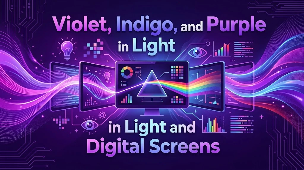
A computer monitor doesn’t contain separate violet and purple lamps.
Instead, it uses combinations of red, green, and blue light.
By changing the intensity of those channels, the display can produce millions of perceived colors.
A digital purple may therefore result from strong red and blue channel values with little or no green. A violet-like display color can use a different balance.
The exact RGB combination depends on the intended color.
Why Screens Can’t Show Every Spectral Color Perfectly
Digital displays have a limited color gamut.
That means the screen can reproduce only a particular region of all colors that humans can perceive.
Even when a display uses a high-quality color space, its output remains dependent on the display’s technology, calibration, brightness, viewing conditions, and color profile.
So a hex code isn’t a wavelength.
That’s an important distinction.
#8000FF, for example, describes a digital RGB color value. It doesn’t mean that the screen is emitting one physical wavelength corresponding to that hexadecimal number.
Hex Codes and Color Names
Hexadecimal values are useful because they give designers a repeatable digital specification.
However, they don’t define universal physical color.
Two screens can display the same RGB value differently if their panels, calibration, brightness, or color profiles differ.
That doesn’t make hex codes useless. It simply means they belong to digital color management, not spectroscopy.
Violet vs. Indigo vs. Purple in Art and Color Mixing
How Artists Create Violet
Traditional painting uses subtractive color mixing.
When you mix pigments, each pigment absorbs certain wavelengths and reflects others. Combining them therefore changes the spectrum of reflected light.
Artists commonly create violet-like colors by combining blue and red pigments.
But the result depends heavily on the pigments.
A warm red mixed with a cool blue may produce a different violet than a cool red mixed with a different blue.
How Artists Create Purple
Purple can move dramatically depending on the ratio and pigments involved.
More blue tends to create a cooler appearance.
More red generally pushes the mixture toward a warmer purple.
White increases lightness while black or complementary colors can reduce brightness and saturation.
Artists can therefore create a huge range of purple-family colors without changing the basic idea of the mixture.
Creating an Indigo-Like Color
Painters often create an indigo-like appearance by using a deep blue with a slight violet or purple bias.
The exact recipe depends on the medium.
For example, an artist working in oils may choose a deep blue pigment and adjust it with a violet. A watercolor painter may use a dark blue mixture and control its concentration with water.
The resulting paint isn’t necessarily chemically identical to historical indigo dye.
It’s simply designed to produce a similar visual effect.
Why Mixing Paint Isn’t the Same as Mixing Light
This distinction is crucial.
Mixing light is additive. Mixing pigments is subtractive.
With light, combining red and blue sources can create a magenta or purple perception.
With pigments, adding more colors generally increases absorption and reduces the amount of light reflected back to your eyes.
That’s why the results can seem counterintuitive if you treat paint like colored light.
Violet, Indigo, and Purple in Nature
Violet in Nature
Violet appears throughout the natural world.
Flowers such as violets provide an obvious example. Minerals such as amethyst can also produce violet appearances through their optical and chemical properties.
However, a violet-looking object doesn’t necessarily reflect one pure wavelength.
Natural surfaces often interact with light through complex mixtures of absorption, reflection, scattering, and sometimes fluorescence.
Indigo in Nature
Indigo has a particularly strong relationship with plants.
Species in the Indigofera genus have historically provided natural indigo dye. Woad (Isatis tinctoria) also played an important role in European dyeing traditions.
The chemistry is fascinating.
Plant material contains precursors that can eventually produce indigo’s characteristic coloring compound through processing and oxidation. Historical production methods relied on soaking, fermentation, aeration, settling, and drying.
Indigo therefore isn’t simply “a blue color found in nature.” It’s also a story about chemistry, agriculture, craftsmanship, and trade.
Purple in Nature
Purple occurs in flowers, fruits, minerals, feathers, and other natural materials.
Plant pigments called anthocyanins play an important role in producing many red, purple, and blue appearances in plants.
Environmental factors can influence their visible color. Acidity, pigment concentration, cellular structure, and other chemical conditions can shift how these pigments appear.
Nature rarely follows the neat color boxes found in a children’s crayon set.
The History and Cultural Meaning of These Colors
Violet Through History
Violet has long carried associations with spirituality, imagination, mystery, and refinement.
Its position between familiar blue and red also gives it a distinctive cultural role. It can feel calm and contemplative like blue while retaining some of the energy associated with red.
The meaning isn’t universal, though.
Color symbolism changes across cultures and historical periods. A designer should therefore avoid treating any symbolic interpretation as a biological fact.
Indigo and the History of Dyeing
Indigo’s cultural importance comes largely from its role as a durable and valuable dye.
Natural indigo production became important across Asia, Africa, Europe, and the Americas. The dye was traded widely and became deeply connected with textile production.
The story also involves complicated economic and colonial histories.
Indigo wasn’t merely a fashionable shade. It was an agricultural commodity that shaped labor systems, trade networks, and local economies.
Purple and Royalty
Purple’s royal reputation has a very practical origin: historical purple dyes could be extremely expensive.
One of the best-known examples is Tyrian purple, produced from marine snails in the Mediterranean region.
The dye was labor-intensive to produce. Historical accounts describe large quantities of snails being processed to obtain relatively small amounts of valuable dye.
That scarcity helped turn purple into a status symbol.
The connection wasn’t simply that purple looked beautiful. It was also that very few people could afford it.
“Historically, purple has often been associated with royalty, faith, prosperity, and healing.” — Smithsonian Institution
The development of synthetic dyes eventually changed that equation.
In 1856, 18-year-old William Henry Perkin accidentally discovered a synthetic purple dye while experimenting with coal-tar chemistry. His discovery helped make brilliant purple shades much more accessible.
The fashion world quickly embraced the new color.
Purple had effectively gone from an expensive luxury to a commercially accessible dye.
What Violet, Indigo, and Purple Symbolize
Violet Symbolism
Violet often suggests:
- Spirituality
- Mystery
- Imagination
- Creativity
- Reflection
- Individuality
In design, violet can feel elegant without the heaviness sometimes associated with very dark purple.
Indigo Symbolism
Indigo commonly suggests:
- Depth
- Wisdom
- Seriousness
- Introspection
- Stability
- Mystery
These associations vary widely by culture and application.
A deep indigo wall, for example, may feel sophisticated and calm. The same color used in a digital interface might communicate something completely different.
Purple Symbolism
Purple commonly carries associations with:
- Royalty
- Luxury
- Power
- Creativity
- Wealth
- Prestige
Its historical connection to expensive dyes explains why luxury brands have repeatedly used purple to suggest exclusivity.
However, modern purple can also feel playful, youthful, futuristic, or unconventional.
Context changes everything.
Common Mistakes About Violet, Indigo, and Purple
“Violet and Purple Are Exactly the Same”
Not scientifically.
The words overlap in everyday speech. Yet spectral violet and nonspectral purple have different physical and perceptual foundations.
“Indigo Has One Exact Wavelength”
That’s too simplistic.
Different scientific sources and color systems use different boundaries for indigo. Some modern approaches don’t treat it as a separate spectral category.
“Purple Is a Wavelength”
Ordinary purple doesn’t correspond to one wavelength.
It can result from combined stimulation from different parts of the spectrum.
“Every Rainbow Has Seven Clearly Separated Colors”
A rainbow is a continuous spectrum.
The familiar seven-color model is a human classification system that became culturally influential through Newton’s work. Historical research also shows that Newton’s own descriptions developed over time.
“A Hex Code Tells You the Wavelength”
It doesn’t.
A hex value describes a digital color representation. Wavelength describes electromagnetic radiation.
Those are different measurements.
Violet vs. Indigo vs. Purple in Different Fields
Science and Optics
Science focuses on:
- Wavelength
- Frequency
- Spectral distribution
- Light intensity
- Human visual response
Here, violet has a much clearer physical definition than purple.
Indigo remains a less precise category.
Art and Painting
Artists care about:
- Pigment properties
- Mixing behavior
- Hue
- Saturation
- Value
- Warm and cool bias
A painter doesn’t need a color to have one wavelength to use it effectively.
Graphic Design and Digital Media
Digital designers work with:
- RGB
- Hexadecimal values
- Color spaces
- Gamut
- Contrast
- Calibration
The word “purple” may describe a visual target while the actual technical specification uses numbers.
Fashion and Interior Design
Designers often use violet, indigo, and purple according to mood.
Deep indigo can create a grounded atmosphere.
Soft violet can feel delicate.
Rich purple can create drama.
The surrounding palette matters just as much as the selected hue.
Printing
Printing introduces another complication.
Printers commonly use CMYK inks rather than RGB light. A purple that looks vivid on a monitor can appear duller on paper because the printer and paper combination has a different gamut.
Professional workflows therefore use color profiles and proofing when accurate reproduction matters.
Read More : Informational vs. Informative: What’s the Difference?
How Lighting Changes Violet, Indigo, and Purple
Natural Daylight
Daylight can reveal subtle differences between blue-violet shades.
A color that appears almost black indoors may show a distinct violet bias under bright daylight.
Warm Indoor Lighting
Warm lighting contains more long-wavelength energy.
As a result, cool colors such as violet and indigo can appear less crisp or somewhat warmer.
This is why a paint color should never be selected solely from a tiny online swatch.
LED and Display Lighting
Modern LEDs vary considerably in spectral output.
Two lights with the same advertised color temperature can still render colored objects differently because their spectral power distributions differ.
Displays create another layer of complexity.
Your phone and desktop monitor may show the same purple differently.
Surrounding Colors
Color perception depends heavily on context.
Place a violet swatch beside a bright red and it may appear cooler.
Place it beside a deep blue and its red component may become more noticeable.
This phenomenon is related to simultaneous color contrast, in which surrounding colors influence how a central color appears.
A Practical Guide to Choosing the Right Color
Choose Violet When…
Violet works well when you want:
- A cool blue-violet appearance
- A connection to the visible spectrum
- A botanical or floral feel
- A spiritual or artistic mood
- A cooler alternative to warm purple
Choose Indigo When…
Indigo makes sense when you want:
- A deep blue appearance
- A blue-violet undertone
- A textile-inspired color
- A traditional rainbow reference
- A darker and more restrained mood
Choose Purple When…
Purple is useful when you want:
- A broader red-blue color family
- A warmer violet-like appearance
- Luxury or prestige
- Creative energy
- A strong accent color
Design Tip: Always Test Colors in Context
Don’t judge these colors from isolated swatches.
Test them against the background, under the intended lighting, and on the final material.
For digital work, check the color on more than one calibrated display when accuracy matters.
For print, make a physical proof.
The same numerical color can produce different visual results in different environments.
Case Study: Why Historical Purple Was a Luxury Color
The story of Tyrian purple demonstrates how physical chemistry can influence cultural meaning.
Ancient producers obtained the dye from marine snails. Creating the color required substantial labor and raw material. That made the resulting dye expensive and difficult to obtain.
The color consequently became linked with status and power.
Centuries later, synthetic chemistry disrupted that relationship.
Perkin’s 1856 discovery of mauveine created a commercially viable route to brilliant purple dye. Smithsonian sources identify the discovery as one of the early milestones in synthetic dye history.
The lesson is bigger than purple:
Color meaning can come from economics as much as appearance.
A color becomes prestigious not only because people like how it looks but also because history teaches people what that color represents.
Case Study: Why Indigo Means More Than a Rainbow Color
Indigo offers a different lesson.
Its identity developed through dye production and later became attached to Newton’s description of the visible spectrum.
The historical dye had a concrete chemical and economic reality. The rainbow category had a perceptual and scientific history.
Those two meanings eventually merged into one word.
That helps explain why indigo can feel oddly difficult to define.
It’s carrying several centuries of meaning at once.
Final Comparison: Violet vs. Indigo vs. Purple
| Question | Violet | Indigo | Purple |
| Is it a spectral color? | Yes | Traditionally, but classification is debated | No |
| Does it have a single wavelength? | Yes, within a spectral range | No universally agreed range | No |
| Where does it sit visually? | Near the short-wavelength end | Between blue and violet in the traditional model | Between red and blue/violet perceptually |
| Is it strongly blue? | Yes | Very strongly | Moderately to strongly |
| Is red prominent? | Less prominent | Usually limited | More prominent |
| Does it have a dye history? | Less central | Extremely important | Yes |
| Is it associated with royalty? | Sometimes | Less strongly | Strongly |
| Common modern use | Science, art, flowers | Textiles, fashion, design | Branding, fashion, art |
Frequently Asked Questions About Violet, Indigo, and Purple
Is violet the same as purple?
No. The terms overlap in everyday English, but they can describe different color concepts. Violet can refer to a spectral color, while ordinary purple generally describes a nonspectral perception produced by combinations of wavelengths.
Is indigo closer to blue or violet?
Indigo traditionally sits between blue and violet. In many modern visual contexts, it appears as a deep blue with a violet bias. The exact boundary remains difficult to define because color categories aren’t sharply separated in the spectrum.
Is indigo actually a color of the rainbow?
Indigo is one of the seven traditional colors commonly taught as the rainbow sequence. However, the physical spectrum is continuous and modern color science doesn’t require indigo to exist as a separate sharply defined spectral band. Historical research also shows that Newton’s treatment of spectral colors developed over time.
What makes violet a spectral color?
Violet corresponds to light in the short-wavelength region of the visible spectrum. It can therefore be associated with a range of actual wavelengths rather than requiring a combination of separated spectral wavelengths.
Why isn’t purple a spectral color?
Purple doesn’t correspond to one wavelength in the visible spectrum. Your visual system can perceive purple when signals associated with red and blue or violet portions of light occur together.
Can violet and purple be used interchangeably?
In casual conversation, yes. In scientific, technical, or design contexts, the distinction can matter. Violet generally has a stronger connection to spectral light, while purple covers a broader nonspectral family.
What is the difference between violet and indigo?
Violet sits at the short-wavelength end of the visible spectrum. Indigo traditionally occupies the region between blue and violet. Indigo also has a major historical identity as a natural dye.
Which color is darker: indigo or purple?
Neither color has one fixed brightness.
Indigo is commonly represented as a deep, dark blue-violet, while purple can range from very light lavender to extremely dark plum. The answer therefore depends on the specific shades being compared.
How do you mix violet with paint?
Artists commonly mix red and blue pigments to create violet. The exact result depends on the pigments’ color bias, concentration, and opacity. A cooler blue and suitable red can produce a cleaner violet than incompatible pigment combinations.
How do you make an indigo-like color?
A deep blue can be shifted toward violet to create an indigo-like appearance. Artists often adjust the mixture according to the medium and desired depth rather than following one universal recipe.
Why is purple associated with royalty?
Historically, some purple dyes were exceptionally expensive and difficult to produce. Tyrian purple, for example, came from marine snails and required extensive processing. Its scarcity helped associate purple clothing with wealth and political power.
Why does violet look different on screens and in paint?
Screens emit light through RGB channels. Paint reflects selected wavelengths after absorbing others. Because these systems produce color differently, a digital violet and a physical violet pigment don’t have to match perfectly.
Are lavender, lilac, and mauve shades of purple?
They are generally considered part of the broader purple or violet color family. However, each name refers to a different range of hue, saturation, and lightness. They shouldn’t be treated as exact synonyms.
Key Takeaways: Violet vs. Indigo vs. Purple
The easiest way to remember the distinction is to separate physics from language and perception.
Violet has the clearest scientific identity. It refers to the short-wavelength end of visible light and can describe a genuine spectral color.
Indigo is more complicated. Its traditional position between blue and violet comes from the seven-color rainbow model associated with Newton. Yet modern color science doesn’t universally treat indigo as a distinct spectral band.
Purple is different again. It generally describes a nonspectral color perception created when your visual system receives combinations of signals from different portions of the spectrum.
Their histories also diverge.
Indigo became famous through dye chemistry and textile production. Purple became famous partly because rare dyes made it a symbol of wealth and royalty. Violet developed strong associations with art, nature, spirituality, and the short-wavelength end of visible light.
The biggest lesson is that a color name isn’t the same thing as a wavelength.
A pigment isn’t the same thing as light.
A digital hex code isn’t the same thing as a spectral measurement.
And a rainbow isn’t really divided into seven physical stripes.
Once those distinctions become clear, violet vs. indigo vs. purple stops being a confusing naming problem and becomes a fascinating example of how physics, chemistry, biology, history, and human perception all meet in something as ordinary as color.